Report:
Introduction:
This report
describe in detail the journey that we took so far to design “Spruce Docket”.
This is an application designed and developed for working students to help them
plan, manage and execute their tasks effectively. In this report are the scope,
design challenge, the idea and concept, and the different iteration processes
that lead to the optimization of the “Spruce Docket” to this point.
Scope:
Our group embarked
on formulating scope for our project. This part we exploit for whom our group
will design an optimized experience for, whose smart rhythm are we supporting? To
help us formulate the scope, three important elements were considered , these
were activities, time and space.
Initially,
our group came up with two different target groups, ‘the working students’ and
‘people who commute to work’. To help us
define these two target groups, we used target group templates to gather
information regarding the activities, time and space. Additionally,
stakeholders’ maps were used to exploit the different stakeholders of each
target group. The information that were filled in the target group template and
the shareholders’ maps were hypothetical and desktop research insights. Below
are the two different target groups scopes and the stakeholders maps.
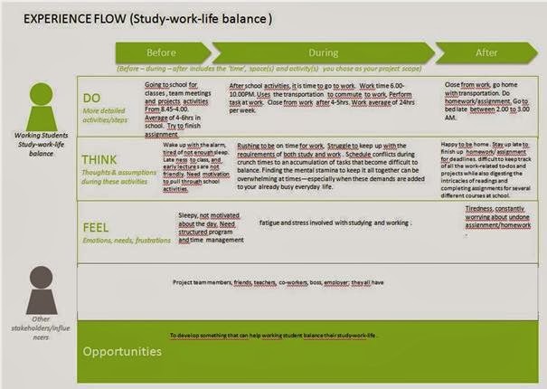
Our target group:
Our group
eventually decided on working students as our target group because of the opportunities
of its diverse activities, time and space that our group could exploit. This
target group( working students) studies, work and have active social lives. To
help us understand our target group and to test our hypotheses, we conducted
qualitative research( in-depth interviews and observation). Before embarking on
fieldwork we created an experience flow based on the scope of our target group
which covered the various activities they perform, the different spaces the use
and the different time of the day. In
the initial experience flow we tried to cover all possible touch points and the
different experiences at these touch points. To clearly understand the different
experiences , we first identified the before, during and after activities of
our target group based generally on the three main activities, study, work and
socializing. This enable us to create experience flow for these activities. In
preparation for our field work we indicated what were already known about our
target group and highlighted what we need to know more about them. We formulated research question and topics to
give us a direction on what we need to know more about our target group and to
test our hypotheses for correctness.
From the
result to our qualitative research we created a persona for our target group
and we built “as is” experience flow.

Design Challenge:
To create a
design challenge for the data and insights to our research result was confusing
and difficult for our group at first because we were considering all the
problems that our target group was facing . This resulted to a rather general
design challenge. The turning point and learning experience was when our group
decided to rate the different problem according to degree of importance. This
eventually revealed the most important problem or rather “moment of truth’. This
was the point that our target group experience the most frustrations that we
could translate to unmet need for them.
The key
insights
The design challenge was to design a
product/service that will help our target group plan, manage and execute task
effectively. Below
is the design challenge from result to a
research question “ How do our target group combine both school and work life?”

Ideas and
concept:
The
challenges above resulted from interviews with the students. Our initial idea of “The Spruce Docket” we
tried to answers both these challenges and even go overboard. With easy planning and scheduling skill that
include visualized plans to a smart agenda in-sync with public transportation
and all their relevant schedules, the Spruce Docket encourage self-discipline
while creating comfort for the students who use it.
The Spruce
Docket makes every day an adventure. It uses tools our target group already
uses, like to do lists on paper and builds on that with the use of positive
reinforcements and efficient directions to match the students’ optimal rhythms.
With these tools, the Spruce Docket together with the students creates the
perfect day, every day!

Ideation”The Spruce Docket
|
In the
conceptualization phase, our focus was to identified where our target group
experience the most frustration, this we translate to unmet needs for them. We
created the concept “The Spruce Docket” by selecting the most important and
relevant ideas that provide the best solution to our problem statement “To design
a product/service to help working student plan, manage and execute their tasks
effectively”, The focus of this concept is on one specific moment in the life
of a working student. After more
research on the target group, we found that it is not the time that is blocking
the students to do their tasks, but the tasks itself. The concept is based on a
triangle with the three edges representing the three main activities of our target group. One of the
program of requirements is a product in tasks planning ,management and
execution of the student.

The Spruce Docket concept
|
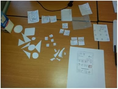
Prototype and test 1:
We built a quick prototype to conduct a pilot
test with participants. The test aim, the research question (s) and the test
plan were used to help build the type of prototype that will be used for the
test. The prototype is made out of paper displaying screen of a mobile phone.
The other components/contents will make up the prototype interface will also be made out of paper. These
components/contents are the different activities like school, work and social
life, written in text and cut out images.
Also blanks cut out paper too to enable participants provide us with possible
contents that will be included in the application that we did not include.
These different contents on paper/post-it and the blank for possible contents
will allow the participants to arrange the different content on the mobile
phone screen. This test will provide insights on the contents and interface
development.
This prototype was built to provide answers to
our research question and sub-questions. To gain insights into how users want
the interface and what should be the relevant contents in the application.
First we wanted to know how they interact with our concept and to know how they
will navigate through this application.
The aim was to learn about the interface and
the contents that will make up the application. The result provide insights on
the interface design, show strong desire for to-do-list feature, provided
information on the steps and navigation processes of using the application.
Result also provided insights on what kind of button to use and where to use
them. More insights on colour preference and where and what to use colour for. While
the pilot test was successful, we as a group learnt that we should have made
our cut-out images and text for the prototype bigger.
First Iteration:
The very obvious iteration was the design of
the interface, apparently, our idea of triangle interface was not good enough
but they prefer the three tasks to be placed linearly instead of triangularly.
With the insights from the pilot test, we redesigned the to-do-list page and
content, we placed buttons and cues to help user perform actions that will help
them perform task with the application easily.

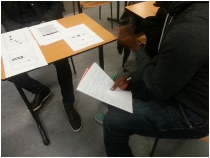
Prototype and test 2:
After the feedback from the first test, it was
time to advance the product in different ways. First of all the interface of
the main screen. There was a lot of feedback about the main screen. According
to the users, the main screen was way too detailed. The most important things
in the main screen are the categories. Based on the feedback, the main screen
has been changed in a familiar way. The three categories are categorized with
three pictograms. These pictograms are also clickable to go to the particular
category. When clicked on a specific category, there is the ability to add a
task.
-
With
this link you have access to the paper prototype which has been used during the
second test:
https://drive.google.com/file/d/0B__es-Q_vSQVQkg5T2hDR0dFRzg/edit?usp=sharing
https://drive.google.com/file/d/0B__es-Q_vSQVQkg5T2hDR0dFRzg/edit?usp=sharing
Some pictures
of the research:
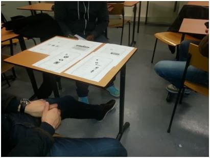
Test 2:
The results of the second test were quite interesting. First of all, the participants really liked the way of researching. The participants were mostly students of the minor so there was an informal atmosphere.
The prototype was built based on the insights we got from the pilot test. These include the new interface for the application, the contents that will be in the different activities and the navigation through the application. We also added features like an overview button, different sounds and how to personalise a particular sound. We also make sure that the to-do-list has everything , like the process to add a task to the to-do-list. We indicated a period like hours, week, month and days. The prototype was made out of paper with digitally print content. This was to make the prototype much real and clear for the participant.
Aim: The aim was to use this prototype to learn how participants interact with the whole application. We also wanted to learn what works well and what did not work well for the participants. We also wanted to learn from the participants about the trigger/motivation to do their task. To learn this we conducted interviews with the participants.
Insights of the 2nd test:
- Symbols not clear
Some student were confused with the work symbol because it looked like a settings button.
- Social life button looks good
- Submit button should be update button
The update button tells the student that it can always be updated if there is a change.
- Personalizing the sound
Some students liked the idea of categorizing the three categories into three colours and sounds.
- Time (3days=3d)
3 days and 2 hours is way too much information according to the students. So they want the idea of uTorrent, where it shows 3d, 2h left.
- Rewarding system with break
According to the students from the 2nd test, they like to have a break after they have finished a few assignments. This break could also be an inspirational exercise to clear your mind.
Changes:
- Symbols
The symbol of the work button will be changed because students thought it was the settings button.
- Submit button will be update button
If you want to add a task you fill in the task and click on submit. Some students tought they couldn't change the task. So the submit button will be changed to "update" button. Like this, the update button tells the students that the tasks can always be changed.
- Time (3days will be 3d, 2hours will be 2h)
The amount of time left for the task will be pronounced as 3d, 2h instead of 3 days and 2 hours.
- Rewarding system with break
The rewarding system will be a break or an inspirational exercise.
- Percent done and left
To challange the students, the application shows the percentage of finished tasks. Like this, the user of the application can easily see what has been achieved already and what should be done.
One by one the changes will be explained:
The results of the second test were quite interesting. First of all, the participants really liked the way of researching. The participants were mostly students of the minor so there was an informal atmosphere.
The prototype was built based on the insights we got from the pilot test. These include the new interface for the application, the contents that will be in the different activities and the navigation through the application. We also added features like an overview button, different sounds and how to personalise a particular sound. We also make sure that the to-do-list has everything , like the process to add a task to the to-do-list. We indicated a period like hours, week, month and days. The prototype was made out of paper with digitally print content. This was to make the prototype much real and clear for the participant.
Aim: The aim was to use this prototype to learn how participants interact with the whole application. We also wanted to learn what works well and what did not work well for the participants. We also wanted to learn from the participants about the trigger/motivation to do their task. To learn this we conducted interviews with the participants.
Insights of the 2nd test:
- Symbols not clear
Some student were confused with the work symbol because it looked like a settings button.
- Social life button looks good
- Submit button should be update button
The update button tells the student that it can always be updated if there is a change.
- Personalizing the sound
Some students liked the idea of categorizing the three categories into three colours and sounds.
- Time (3days=3d)
3 days and 2 hours is way too much information according to the students. So they want the idea of uTorrent, where it shows 3d, 2h left.
- Rewarding system with break
According to the students from the 2nd test, they like to have a break after they have finished a few assignments. This break could also be an inspirational exercise to clear your mind.
- Symbols
The symbol of the work button will be changed because students thought it was the settings button.
- Submit button will be update button
If you want to add a task you fill in the task and click on submit. Some students tought they couldn't change the task. So the submit button will be changed to "update" button. Like this, the update button tells the students that the tasks can always be changed.
- Time (3days will be 3d, 2hours will be 2h)
The amount of time left for the task will be pronounced as 3d, 2h instead of 3 days and 2 hours.
- Rewarding system with break
The rewarding system will be a break or an inspirational exercise.
- Percent done and left
To challange the students, the application shows the percentage of finished tasks. Like this, the user of the application can easily see what has been achieved already and what should be done.
One by one the changes will be explained:
-
Rectangle
below the three elements for an overview
There are three things to say about the main screen. First of all a few participants want a rectangle below the three categories so they have an overview of ALL the tasks (all 3 categories combined). They liked this idea because then you have everything on one screen instead of switching between the screens when you are trying to plan something.
There are three things to say about the main screen. First of all a few participants want a rectangle below the three categories so they have an overview of ALL the tasks (all 3 categories combined). They liked this idea because then you have everything on one screen instead of switching between the screens when you are trying to plan something.
-
Add
a task from the main screen AND particular category.
Secondly some participants didn’t want to click on school, social life or work to add a task. They want to add a task right away when they are in the main screen. So there will come an “add a task” button on the bottom left of the screen.
Secondly some participants didn’t want to click on school, social life or work to add a task. They want to add a task right away when they are in the main screen. So there will come an “add a task” button on the bottom left of the screen.
-
Settings
button on the bottom right & instructions
Some participants didn’t know what the app could actually do and what his functions are. So they were talking about a settings button on the bottom right. This button doesn’t only allow the user to change the settings, but also has some information about the application itself.
Some participants didn’t know what the app could actually do and what his functions are. So they were talking about a settings button on the bottom right. This button doesn’t only allow the user to change the settings, but also has some information about the application itself.

-
Triggers: URL link to the actual assignment from blackboard.
The trigger is an interesting chapter in the application. What triggers students to do their assignments? During the past 7 weeks we found out that a lot of students have troubles with just: starting. A few students talked about a link to blackboard where you can see the assignment posted by the teacher. Like this, the gap between searching information and starting the actual assignment will be closed. There will also be a link school library for information. This information will be digital magazines or e-books.
-
Opportunity
to add categories.
In the future it will also be possible to add categories. Like this, you can arrange your own home screen. Separating tasks in different kind of categories gives more structure. A category users could add for instance: work at home.
In the future it will also be possible to add categories. Like this, you can arrange your own home screen. Separating tasks in different kind of categories gives more structure. A category users could add for instance: work at home.
Nice overview! It does give me the impression that your testing was very much focused on the interaction design and less on the concept itself. Did you really test/verify your assumptions about the concept itself?
BeantwoordenVerwijderen